Impact
- Got the team aligned when nobody knew what they wanted, and the design was approved for production
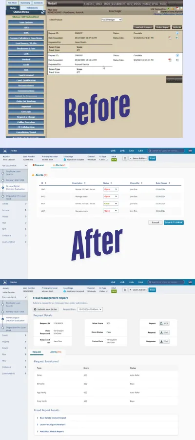
- One table for every fraud score
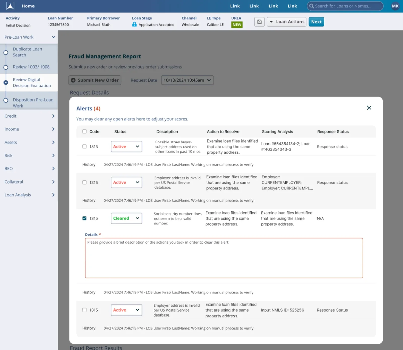
- Active / Cleared alert states, with a required note and history for every cleared alert
| My Role | UX designer, from first draft to approved design |
| Team | A Newrez value stream and a Newrez developer |
| Timeline | July – August 2024 |
| Platform | Desktop web, inside the loan system |
The Problem
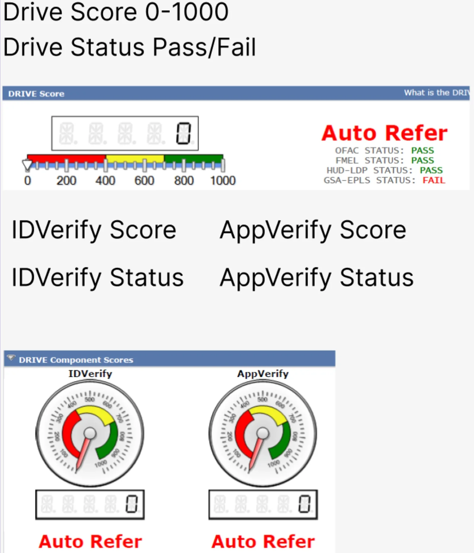
Before a loan moves forward, it gets a fraud check from DataVerify. The results lived in a dated screen: a 0–1000 score bar, speedometer gauges, red "Auto Refer" text and a list of pass/fail checks.
It was dated and confusing, and it was missing what the team needed most: a way to take action, see who approved or rejected a loan, and undo a decision.
A Vague Ask
A Newrez value stream asked me to "build a solution." The direction was vague, and so were the solutions they suggested. No one defined who would use the screen.
So I worked from what I had: screenshots of the old scores, the old screen, and what the team told me.
A First Draft That Missed
I built a quick first version on purpose, to find out if I was headed the right way. When we tested it, it wasn't what they wanted.
Honestly, that miss helped. It showed me nobody had pinned down the real problem yet.
Back to the Whiteboard
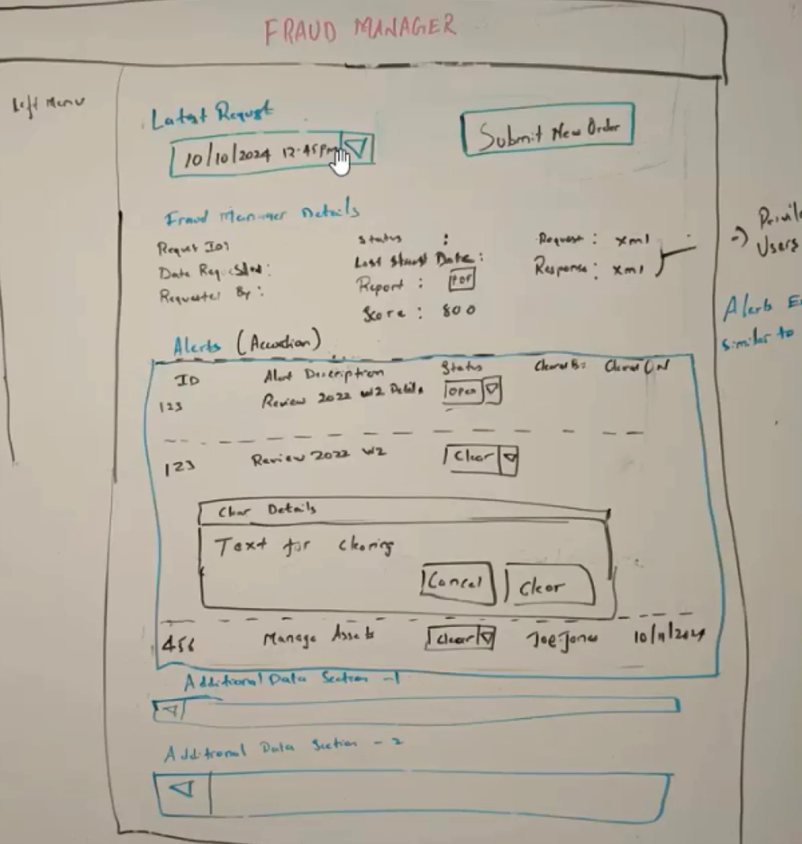
I set up a one-on-one with a Newrez developer to dig into the real ask. We sketched the page together on a whiteboard: the latest request, a way to submit a new order, the request details, and an alerts list where you clear an alert right where you see it.
The Solution
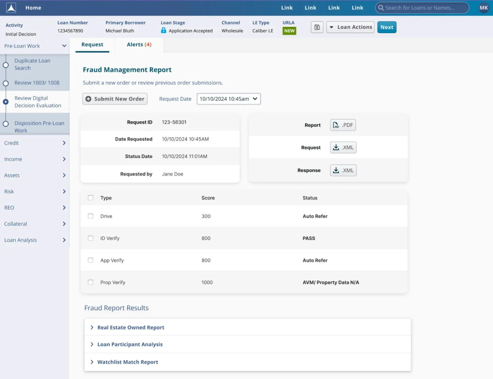
The Fraud Management Report sits inside the loan workflow, as a step in Pre-Loan Work.
1. Every score in one table. Drive, ID Verify, App Verify and Prop Verify each get one row with a score and a plain status. No more gauges to decode.
2. Alerts you can act on. An Alerts tab shows a count, so you know what's waiting. Each alert has a description, an action to resolve it and an Active / Cleared status.
3. Clear with a reason. Clearing an alert asks for a short note, and every alert keeps its history. Anyone who opens the loan later can see who cleared what and why.
4. Everything else one click away. The PDF report and the request and response files are ready to download. Longer reports, like Real Estate Owned and Watchlist Match, sit in sections you open only when you need them.
Outcome
The team approved the design for production. They thanked me and were really excited about the solution.
I was laid off before it launched, so I didn't get to see it go live or measure how it performed.
What I Learned
- Every decision needs a paper trail. Requiring a note to clear an alert, plus a history for each one, means anyone can see who made a call and why.
- When the ask is vague, go to the people building it. One session with a developer gave me more clarity than the group meetings did.
- Pretty isn't the same as clear. The old gauges looked fancy, but a simple score and status let the team decide faster.
- Next time: write the problem down first. I'd agree on one sentence about who it's for and what it should fix before I design anything.